The spectrogram is one of the most important tools in a bioacoustician’s arsenal. They allow us ‘see’ sound, which helps us quickly review large datasets or find patterns that we don’t or can’t hear. I generate and plot spectrograms in a variety of ways. Typically, I turn to Audacity if I want to plot something up quickly, Raven to make a few quick measurements or annotations, and Matlab for anything more detailed. This is all fine and good, but recently I’ve had a few projects that require producing some nice looking spectrograms in R. Given that I’m a big fan of R, and of spectrograms, I thought this would make a good first post for my new website.
I should emphasize that this post is more cookbook than concept; there are many other reasources available to learn the nitty gritty details about spectrograms. For more background I’d start at the fantastic DOSITS webpage.
Read an audio file
First we have to find a signal to plot. I’m going to take an example of a right whale upcall we recorded off the Scotian Shelf a couple years ago, but hopefully this will work for any .wav file.
library(tuneR, warn.conflicts = F, quietly = T) # nice functions for reading and manipulating .wav files

# define path to audio file
fin = '~/Data/online_sound_examples/right_whale_upcall1.wav'

# read in audio file
data = readWave(fin)

# extract signal
snd = data@left

# determine duration
dur = length(snd)/data@samp.rate
dur # seconds
## [1] 3.588

# determine sample rate
fs = data@samp.rate
fs # Hz
## [1] 2000
Plot waveform
# demean to remove DC offset
snd = snd - mean(snd)

# plot waveform
plot(snd, type = 'l', xlab = 'Samples', ylab = 'Amplitude')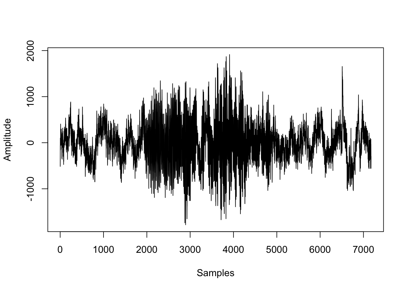
Define spectrogram parameters
The next step is to define the parameters used to construct the spectrogram. What each parameter is and how to choose them appropriately is the topic for another discussion. I’ll just pick some reasonable values as a demonstration.
# number of points to use for the fft
nfft=1024

# window size (in points)
window=256

# overlap (in points)
overlap=128
Plot the spectrogram
library(signal, warn.conflicts = F, quietly = T) # signal processing functions
library(oce, warn.conflicts = F, quietly = T) # image plotting functions and nice color maps

# create spectrogram
spec = specgram(x = snd,
                n = nfft,
                Fs = fs,
                window = window,
                overlap = overlap
)

# discard phase information
P = abs(spec$S)

# normalize
P = P/max(P)

# convert to dB
P = 10*log10(P)

# config time axis
t = spec$t

# plot spectrogram
imagep(x = t,
       y = spec$f,
       z = t(P),
       col = oce.colorsViridis,
       ylab = 'Frequency [Hz]',
       xlab = 'Time [s]',
       drawPalette = T,
       decimate = F
)
That’s it! Happy plotting :)
Bonus: functionize it
Here’s an example of how to put everything above into a tidy plotting function. I’ve made a few changes here that were specific to my application at the time:
The main data input is a
Formal class Waveobject in R (i.e. input fromtuneR), but you could easily change things around to accept the path to a.wavfile.If the
t0input is 0, the time axis is in seconds elapsed since the start of the file, but you can also pass aPOSIXctvalue to display the time/date.I have included switches to optionally plot the spectrogram (
plot_spec), normalize the waveform (normalize), and/or return the spectrogram data (return_data).The
...means that I can pass additional arguments to theimagep()plotting functionI took some stylistic liberties and chose to create a spectrogram against a dark background, just because I like the way it looks
spectro = function(data, nfft=1024, window=256, overlap=128, t0=0, plot_spec = T, normalize = F, return_data = F,...){

  library(signal)
  library(oce)

  # extract signal
  snd = data@left

  # demean to remove DC offset
  snd = snd-mean(snd)

  # determine duration
  dur = length(snd)/data@samp.rate

  # create spectrogram
  spec = specgram(x = snd,
                  n = nfft,
                  Fs = data@samp.rate,
                  window = window,
                  overlap = overlap
  )

  # discard phase info
  P = abs(spec$S)

  # normalize
  if(normalize){
    P = P/max(P)
  }

  # convert to dB
  P = 10*log10(P)

  # config time axis
  if(t0==0){
    t = as.numeric(spec$t)
  } else {
    t = as.POSIXct(spec$t, origin = t0)
  }

  # rename freq
  f = spec$f

  if(plot_spec){

    # change plot colour defaults
    par(bg = "black")
    par(col.lab="white")
    par(col.axis="white")
    par(col.main="white")

    # plot spectrogram
    imagep(t,f, t(P), col = oce.colorsViridis, drawPalette = T,
           ylab = 'Frequency [Hz]', axes = F,...)

    box(col = 'white')
    axis(2, labels = T, col = 'white')

    # add x axis
    if(t0==0){

      axis(1, labels = T, col = 'white')

    }else{

      axis.POSIXct(seq.POSIXt(t0, t0+dur, 10), side = 1, format = '%H:%M:%S', col = 'white', las = 1)
      mtext(paste0(format(t0, '%B %d, %Y')), side = 1, adj = 0, line = 2, col = 'white')

    }
  }

  if(return_data){

    # prep output
    spec = list(
      t = t,
      f = f,
      p = t(P)
    )

    return(spec)
  }
}
Test it!
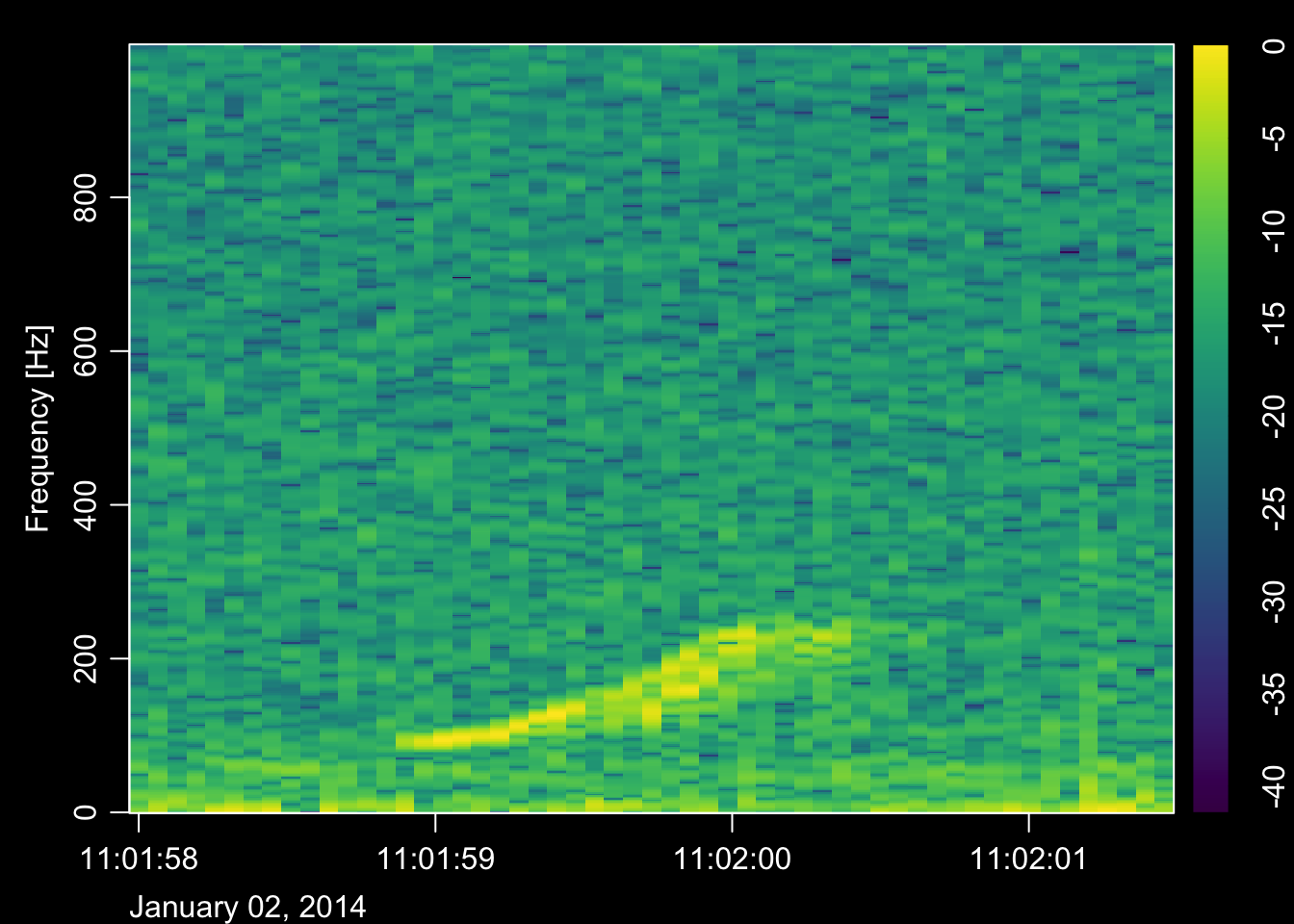
Here’s the function in action on the same data file
# call the spectrogram function
spectro(data,
        nfft=1024,
        window=256,
        overlap=128,
        t0=as.POSIXct('2014-01-02 11:01:58'),
        plot_spec = T,
        normalize = T,
        return_data = F
)