Updated 2018-10-17 to replace
ggmapwithggplot2
There are a number of different ways to make basic maps in R. In the last year or so I’ve become a big fan of leaflet and the R leaflet package that makes these maps a breeze to build in R. Leaflet makes very nice online interactive maps, but doesn’t provide a great option for a static map like you would put in a publication or presentation. I’ve jumped around between a few different methods for making static maps, but for the purposes of this post I’ll focus on a few that I like and use most.
The first method uses the oce package, developed primarily by Dan Kelley and Clark Richards at my native Dalhousie. The other uses the ggplot2 package, which is the brainchild of Hadley Wickham and others in the tidyverse crowd. My plan is to present simple reproducible examples for each map-making method to show how to use them to display basic types of spatial data: contours (bathymetry), lines, points, and polygons.
Get data
Step one is to get the data that we’ll be plotting. A very handy tool for this is the getNOAA.bathy() function from the marmap package, which, perhaps not surprisingly, gets user-selected bathymetric data from the NOAA ETOPO database. There are a number of other great functions within marmap, but, for reasons I won’t get into here, I’ve never quite been satisfied with using it to make maps. Anyway, here’s the data I’ll be using:
library(marmap)

# get bathymetry data
b = getNOAA.bathy(lon1 = -68, lon2 = -62, lat1 = 40, lat2 = 45,
                  resolution = 1)
## Querying NOAA database ...
## This may take seconds to minutes, depending on grid size
## Building bathy matrix ...

# make a simple track line
lin = data.frame(
  lon = c(-65.17536, -65.37423, -65.64541, -66.06122, -66.15161),
  lat = c(43.30837, 42.94679, 42.87448, 42.92871, 42.72985)
)

# make a few points
pts = data.frame(
  lon = c(-65.3, -65.7, -64.1),
  lat = c(43.4, 43, 42.9)
)

# build a polygon (in this case the 'Roseway Basin Area To Be Avoided')
ply = data.frame(
  lon = c(-64.916667,-64.983333,-65.516667, -66.083333),
  lat = c(43.266667,  42.783333, 42.65, 42.866667)
)
oce
The following map with oce does not use a projection, which basically means that all plotting occurs as if the world were completely flat. Plotting in this way is quick and convenient, especially because it allows you to use all of R’s base graphic functions, but is not appropriate in many cases. I typically use this approach when plotting relatively small areas (maybe 10s of kilometers) and in circumstances where exact distances aren’t crticially important.
library(oce)
library(ocedata)
data("coastlineWorldFine")

# convert bathymetry
bathyLon = as.numeric(rownames(b))
bathyLat = as.numeric(colnames(b))
bathyZ = as.numeric(b)
dim(bathyZ) = dim(b)

# define plotting region
mlon = mean(pts$lon)
mlat = mean(pts$lat)
span = 300

# plot coastline (no projection)
plot(coastlineWorldFine, clon = mlon, clat = mlat, span = span)

# plot bathymetry
contour(bathyLon,bathyLat,bathyZ,
        levels = c(-50, -100, -150, -200, -250),
        lwd = c(1, 1, 2, 2, 3),
        lty = c(3, 1, 3, 1, 3),
        drawlabels = F, add = TRUE, col = 'darkgray')

# add depth legend
legend("bottomright", seg.len = 3, cex = 0.8,
       lwd = c(1, 1, 2, 2, 3),
       lty = c(3, 1, 3, 1, 3),
       legend = c("50", "100", "150", "200", "250"),
       col = 'darkgray', title = "Depth [m]", bg= "white")

# add map data
points(pts, pch = 16, col = 'red')
lines(lin, col = 'blue')
polygon(ply, lty = 2)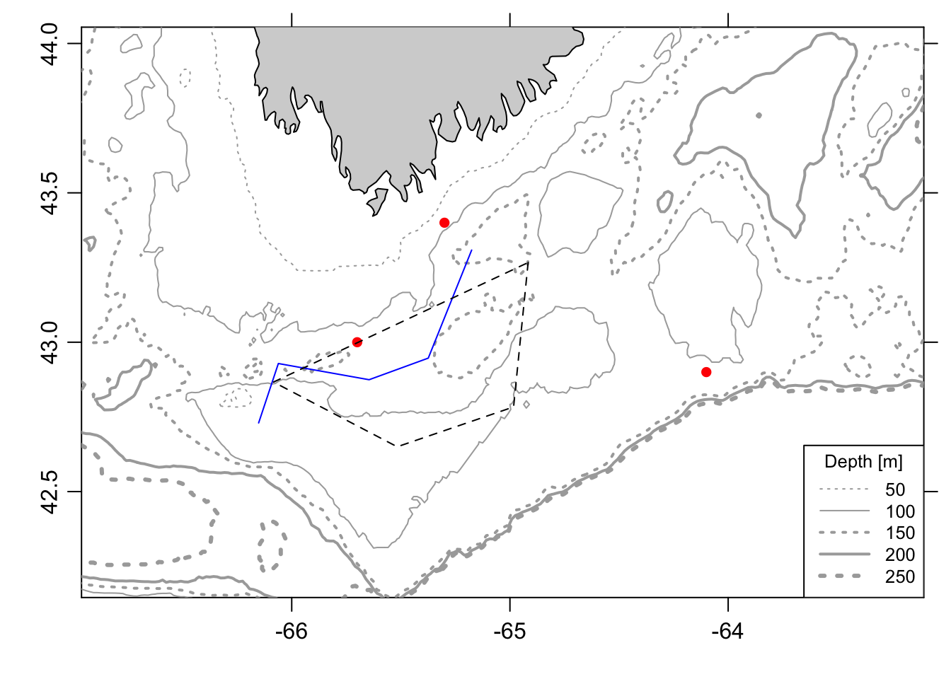
When the need arises for a projection, as is often the case, the oce package has an impressive number available. Check out Dan’s blog post for a full list. Plotting projected data is slower and a little bit clunkier because you need to use oce custom functions (e.g., mapPoints(), mapLines(), etc), but in my experience this tends to work well. I can’t say the resulting maps are spectacularly pretty, but they’re very accurate and theoretically quite customizable if there’s something you’d like to change or add. Here’s what that looks like:
# plot coastline (with projection)
plot(coastlineWorldFine, clon = mlon, clat = mlat, span = 200,
     projection="+proj=merc", col = 'lightgrey')

# plot bathymetry
mapContour(bathyLon, bathyLat, bathyZ,
           levels = c(-50, -100, -150, -200, -250),
           lwd = c(1, 1, 2, 2, 3),
           lty = c(3, 1, 3, 1, 3),
           col = 'darkgray')

# add depth legend
legend("bottomright", seg.len = 3, cex = 0.7,
       lwd = c(1, 1, 2, 2, 3),
       lty = c(3, 1, 3, 1, 3),
       legend = c("50", "100", "150", "200", "250"),
       col = 'darkgray', title = "Depth [m]", bg = "white")

# add map data
mapPoints(longitude = pts$lon, latitude = pts$lat, pch = 16, col = 'red')
mapLines(longitude = lin$lon, latitude = lin$lat, col = 'blue')
mapPolygon(longitude = ply$lon, latitude = ply$lat, lty = 2)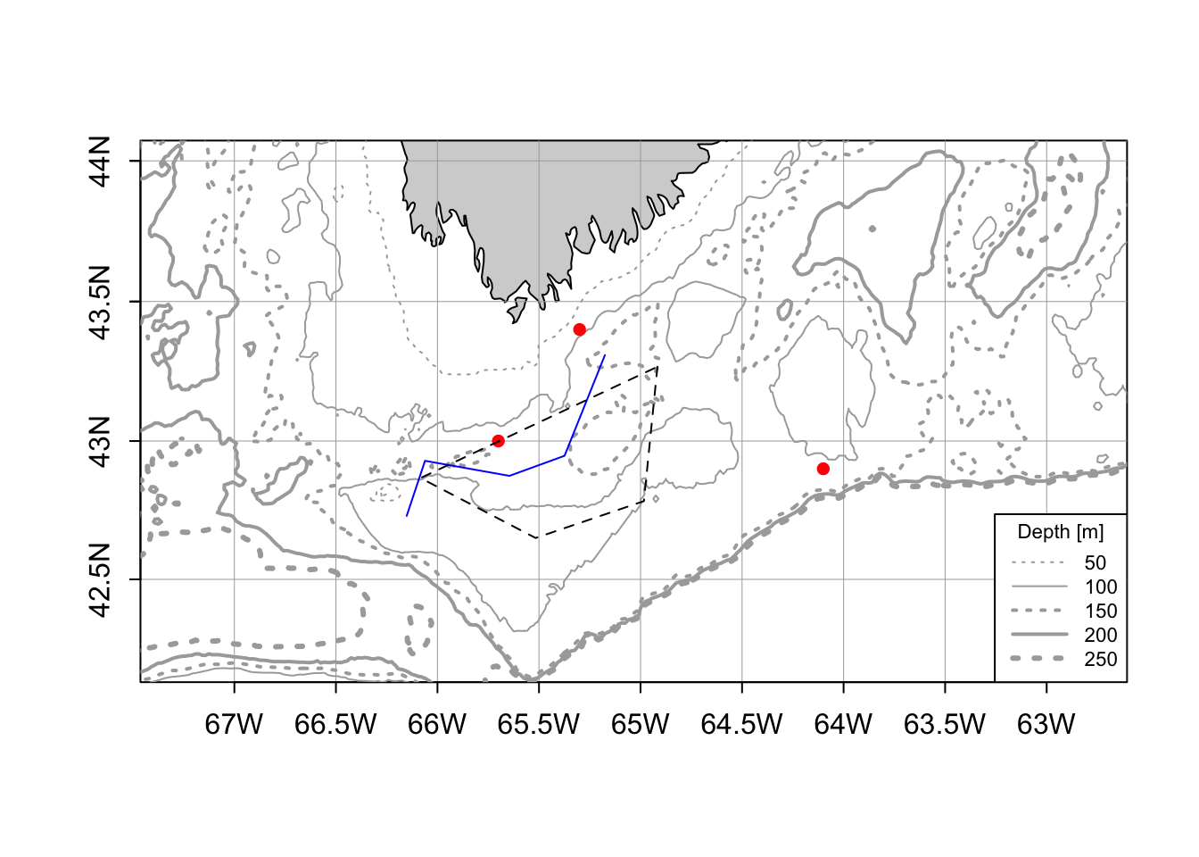
ggplot2
ggplot2 doesn’t use R‘s basic graphical functions (at least at the surface), but instead uses a different ’grammer of graphics’ (hence ‘gg’) syntax for plotting. As a result, the plotting philosophy and coding syntax are quite different. This can create a bit of a learning curve at first, but offers a lot of incredibly powerful features. Here’s a quick example:
library(ggplot2)
library(mapdata)

# convert bathymetry to data frame
bf = fortify.bathy(b)

# get regional polygons
reg = map_data("world2Hires")
reg = subset(reg, region %in% c('Canada', 'USA'))

# convert lat longs
reg$long = (360 - reg$long)*-1

# set map limits
lons = c(-67.5, -63.5)
lats = c(42, 45)

# make plot
ggplot()+

  # add 100m contour
  geom_contour(data = bf,
               aes(x=x, y=y, z=z),
               breaks=c(-100),
               size=c(0.3),
               colour="grey")+

  # add 250m contour
  geom_contour(data = bf,
               aes(x=x, y=y, z=z),
               breaks=c(-250),
               size=c(0.6),
               colour="grey")+

  # add coastline
  geom_polygon(data = reg, aes(x = long, y = lat, group = group),
               fill = "darkgrey", color = NA) +

  # add polygon
  geom_polygon(data = ply, aes(x = lon, y = lat),
               color = "black", alpha = 0.3) +

  # add line
  geom_path(data = lin, aes(x = lon, y = lat),
            colour = "black", alpha = 1, size=0.3)+

  # add points
  geom_point(data = pts, aes(x = lon, y = lat),
             colour = "black", fill = "grey",
             stroke = .5, size = 2,
             alpha = 1, shape = 21)+

  # configure projection and plot domain
  coord_map(xlim = lons, ylim = lats)+

  # formatting
  ylab("")+xlab("")+
  theme_bw()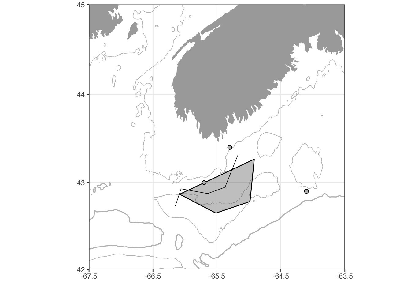
Pretty nice! One issue I still have with this map is that I haven’t been able to find an elegant way to add labels to the contour lines. There are ways to do this in normal ggplot2 contour plots (like with the direct.label package), but these fail with projected data. Perhaps I’ll file an issue with the developers to see if they can shed any light.
Summary
Both oce and ggplot2 offer simple, accurate, and elegent tools for plotting bathymetric data. I’m newer to ggplot2 for mapping, but I’m quite impressed with its capabilities. I suspect I’ll continue to use oce for quickly plotting results on the fly, but will definitely begin to use and explore ggplot2 for presentation and publication quality visuals.