Motivation
I do a lot of work with geographic position data from things that move over time, like ships, planes, ocean gliders, simulated whales, and real whales. The data sources can vary, but all their movement data can essentially be reduced to a table with columns for time, latitude, longitude, and some kind of track identifier, and a row for each new position. There are often other data types too, like from oceanographic sensors, but we won’t go there.
These data by definition vary in both time and space, which can be difficult to represent on a static plot. That’s one reason why I’ve dabbled in making interactive plots and movies. In the past I’ve made movies manually by iteratively printing plots and then stitching them back together with a command-line utility. It works fine, but it’s a bit limited and not particularly convenient. I’ve known about gganimate for awhile, but haven’t had a chance to dig in until now.
I decided to test out gganimate on using drifter data. Drifters are basically just floating GPS transmitters that are deployed to track surface currents in the ocean over long periods of time. The incredible Global Drifter Program has been maintaining a massive array of thousands these drifters across the world oceans for 40 years. It’s an unbelievable dataset, and all openly available!
Step 1: Get data
I decided to try out rnaturalearth to grab basemap data with one line. Another trick here is querying the NOAA ERDDAP data server via url, and reading that data directly using read_csv(). You can also select and download the data manually from their website here.
# libraries
library(tidyverse)
library(rnaturalearth)
library(gganimate)

# get basemap data
bg = ne_countries(scale = "medium", continent = 'north america', returnclass = "sf")

# get drifter data
df = read_csv('http://osmc.noaa.gov/erddap/tabledap/gdp_interpolated_drifter.csvp?ID%2Clongitude%2Clatitude%2Ctime%2Cve%2Cvn&longitude%3E=-70&longitude%3C=-50&latitude%3E=35&latitude%3C=50&time%3E=2018-01-01&time%3C=2019-01-01')

# assign convenient column names
colnames(df) = c('id', 'lon', 'lat', 'time', 've', 'vn')
Step 2: Process your data
There are two tricks here. The first is to use a tidy approach to calculate daily average positions and speeds. The second is to create table with all possible combinations of instrument ID and date, then merge that with the existing data. This is a convenient way to add NAs on days when a drifter did not transmit, which will cause a line break when plotting. If you don’t do this you’ll end up with spurious lines connecting transmissions that are separated by multiple days.
# compute daily average positions and speeds
df_ave = df %>%
  mutate(date=as.Date(time)) %>%
  group_by(id,date) %>%
  summarise(
    lat = mean(lat, na.rm = TRUE),
    lon = mean(lon, na.rm = TRUE),
    spd = mean(sqrt(ve^2+vn^2), na.rm=TRUE)
  )

# create 'ideal' data with all combinations of data
ideal = expand_grid(
  id = unique(df_ave$id),
  date = seq.Date(from = min(df_ave$date), to = max(df_ave$date), by = 1)
)

# create complete dataset
df_all = left_join(ideal,df_ave)
Step 3: plot
I made this plot a little differently in anticipation of animation. Most importantly, you need to specify a group aesthetic for geom_point() so gganimate knows which points to include. If you don’t do this you’ll end up with a bunch of random points aimlessly drifting around your animation. Of course you also need to have geom_path() to plot lines so they’re visible in the animation, even though you can barely see them on the static map. And don’t worry about the labels yet - they’re handled in the animation step.
The static map is a bit of a mess, but check out the Gulf Stream! Cool!
p = ggplot()+

  # basemap
  geom_sf(data = bg)+
  coord_sf(xlim = range(df_all$lon, na.rm = TRUE),
           ylim = range(df_all$lat, na.rm = TRUE),
           expand = FALSE)+

  # lines and points
  geom_path(data = df_all,
            aes(x=lon,y=lat,group=id,color=spd),
            alpha = 0.3)+
  geom_point(data = df_all,
             aes(x=lon,y=lat,group=id,fill=spd),
             alpha = 0.7, shape=21, size = 2)+

  # formatting
  scale_fill_viridis_c(option = "inferno")+
  scale_color_viridis_c(option = "inferno")+
  scale_size_continuous(range = c(0.1,10))+
  labs(x=NULL, y=NULL,
       fill = 'Speed (m/s)',
       color = 'Speed (m/s)')+
  theme_dark()+
  theme(panel.grid = element_blank())
p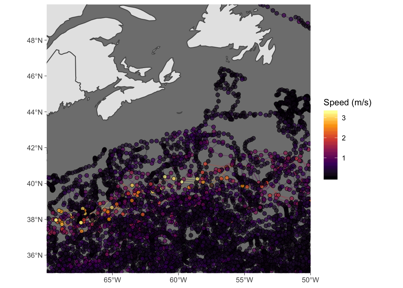
Step 4: animate
It just takes a few lines to turn the messy plot into a beautiful animation. Before running this, though, you may need to install the gifski package to render the animation as a gif.
I learned a few tricks through trial and error, and from poking around online. One is to use transition_reveal() to keep previous tracks on the map, rather than erasing them. Another is to use ease_aes('linear') to help smooth the transition between frames. The last one is to specify nframes = 365 within animate() so that each day gets a frame, which again helps keep the animation nice and smooth. You can reduce this to speed up plotting.
Now sit back and watch the craziness of open ocean dynamics unfold before your eyes! Amazing!
# animate
anim = p +
  transition_reveal(along = date)+
  ease_aes('linear')+
  ggtitle("Date: {frame_along}")

animate(anim, nframes = 365, fps = 10)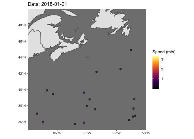
Conclusions
In short, I’m totally converted. It’s really slick, and because it builds off of ggplot(), which I now use almost exclusively, I can now convert static plots to beautiful animations in just a couple extra lines (i.e., just step 4). I think this will become a staple in my data vis toolbox.